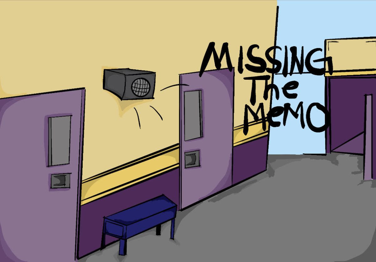

Similar to an epidemic, poster blindness has swept throughout Mt SAC Early College Academy (MECA)like a plague; originating from misinformation and mundane design, posters (and presentations) blend noteworthy points into the background as nothing more than fleeting thoughts.
Almost instinctively, we are drawn to our screens, which boast bright colors and constant, specialized entertainment.
In comparison, our lives seem dull—and within this statement lies an underlying issue: how are we supposed to absorb the information we need if we don’t even notice it?
¨[ASB] had really good posters with all the proper information and nobody knew what was going on,¨ said Gabriel Nichols, MECA’s ASB adviser.
In the year prior, posters were heavily relied on to spread information among other outlets. Despite this, students still struggle to stay informed about upcoming events, turning towards word of mouth as the most effective way to learn about almost anything.¨Its my goal that students don’t get information from posters,¨ Nichols said, instead opting to have posters serve as,¨a cute reminder¨
But, it’s almost as if the posters themselves are made to fade into the background.
The power of good design
There is a certain skill that comes with creating good, visually appealing design. In the words of Mighty Fine Design,“Good design doesn’t necessarily mean a work of art¨
Just like with big advertisements on TV, we don’t even realise the effects of good design, and in that—good advertising. This form of media is what constantly pushes us to have food at any, and all opportune moments. It’s the very reason why you reach for popcorn while watching a movie, or why you order junk food while watching sports games; the advertisements we see on TV are indirectly pushing us towards these behaviors.
This same idea applies to the presentations and posters at school.
What makes something memorable is the shock factor that comes with it. As Golden Steps ABA said, ¨Teenagers have an average attention span of 8 seconds, similar to that of a Gen Z individual and a goldfish.¨ You´re more likely to click on a video with something that grabs your attention—whether it’s an uncanny photo or bold title with a shocking claim.
Keeping kids’ attention can be incredibly difficult in this day and age, and our media is incredibly representative of that.
Having said that, the only way to combat this is to adapt to it. In the educational world especially, the effects of this are prominent, and interestingly enough—beneath all of the gags and jokes about having Subway Surfers play in the corner of our screens, there lies some amount of truth.
Students lack the same drive to continue actively learning, especially when the subjects in question aren’t of interest.
¨Lapses occurred about every two minutes,¨ said an article by Open Colleges, referring to a study made in 2010 that utilized clickers to collect data on whether students found themselves distracted during class. In this, the term “lapses” represented the period where students were fully immersed in the lesson.
Simple presentations and long-winded lectures no longer have the same effects on students as they have before. An article from Columbia Theological Seminary said, ¨a learner retains 10% of what he or she hears, 20% of what he or she reads, and 50% of what he or she sees.¨
That being said, by making the information students are exposed to more visually appealing, it increases the chance of maintaining their focus on that particular graphic instead—therefore engaging them in the lesson and allowing them to retain more knowledge as a whole.
Inviting Information
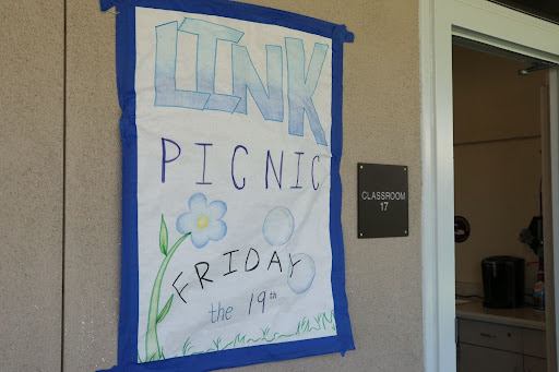
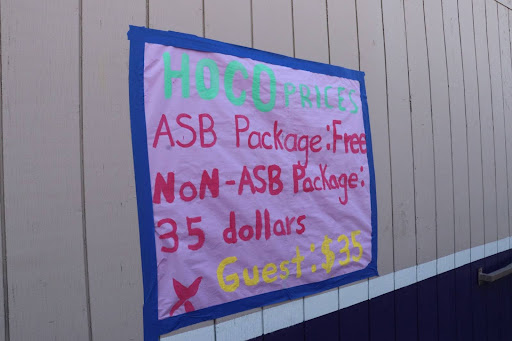
When comparing the two images below, which of the two stands out more?


-
Image #1
Image by Iliana Maldonado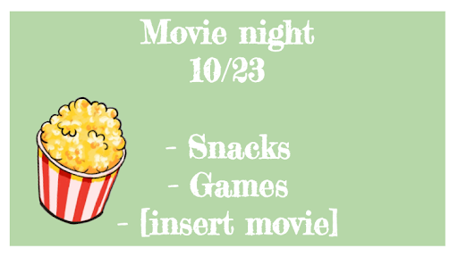
-
Image # 2
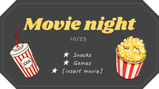
For most people, the poster on the right would grab your attention. It has a bold, eye-catching font, and big graphics to draw you in. Argonne National Laboratory adds on to this idea, stating how presenters use posters to¨ (1) read about their work, and (2) understand and remember the information¨
Based on a sample of about 20 MECA students and staff, almost all of them chose the second poster. ¨The first one… had the white which made it hard to see,¨ said Integrated Math I and II teacher, Crystal Guevara.
Even though both posters convey the same message, one is more likely to draw you in. Big fonts and good graphics tell a general summary of the event, pulling the reader in with smaller text to get you taking a step further.
The difference between the two is subtle, but good design can make the distinction between a good poster and a great one.